

Color Psychology: Exploring The Emotional Impact Of Hues In Your Home
Color is one of the most powerful tools we have in design. It can make a room feel intimate or expansive, energetic or restful, sophisticated or playful. It can highlight architecture, disguise imperfections, and completely change how we experience a space.
But I also think we give color psychology a little too much authority.
There are plenty of theories about what certain colors are supposed to make us feel. I think those ideas are useful, but they aren't rules. The right color has just as much to do with the architecture, natural light, furnishings, and, most importantly, the person living there.
So, here’s my take on some of the colors we use most and what they can actually bring to a home.
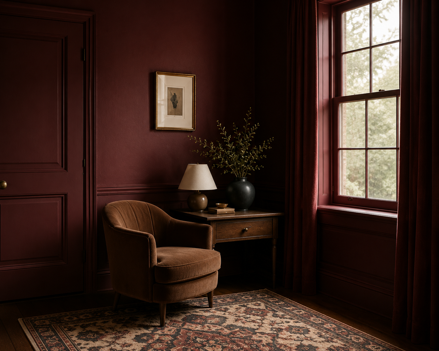
Confident, Warm and Not for the Indecisive.
Red has presence.
Red has presence. There’s really no getting around it. It can bring warmth, energy, richness, and a sense of history to a room. Deep oxblood, brick, burgundy, and earthy reds can be especially beautiful in dining rooms, libraries, powder rooms, and smaller spaces where you actually want a little drama. The key word here is intentional.
Red isn't usually the color I’d choose because someone told me it promotes energy. I’d choose it because the room can handle it and because it makes the architecture, furnishings, and materials around it look better.
And yes, there is absolutely a difference between a beautifully moody oxblood room and a room that looks like someone found a gallon of red paint in the garage.
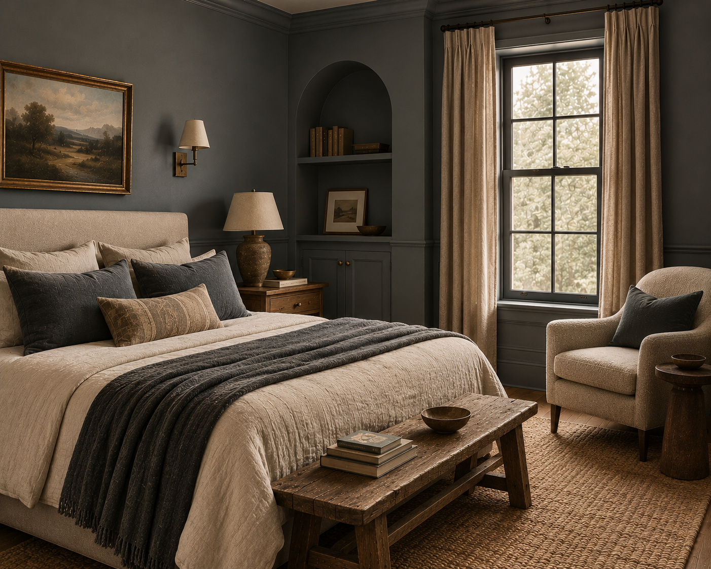
Calm Without Being Predictable
Blue has earned its reputation for feeling calming, but there’s much more range here than people give it credit for. A dusty blue can feel soft and atmospheric. Navy can feel tailored and sophisticated. A blue-gray can create a quiet backdrop without becoming another beige room.
But undertones matter tremendously with blue. The wrong one can quickly turn cold, especially in a room without much natural light.
This is why I will continue saying it: sample your paint.
The tiny square on your phone is not telling you the truth.
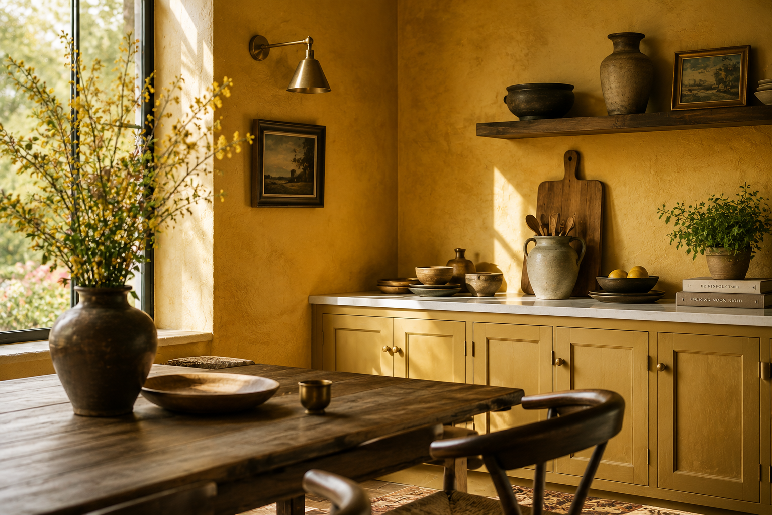
Proceed With Intention
I like yellow. There, I said it. But yellow requires restraint. Soft ochre, mustard, muted straw and buttery cream can bring incredible warmth to a room. They work beautifully with aged wood, stone, brown, olive and antique brass.
Bright primary yellow covering four walls? That's a much harder sell for me.
Yellow doesn't have to scream sunshine to make a room feel warmer. Sometimes the best version is the one you almost wouldn't call yellow at all.
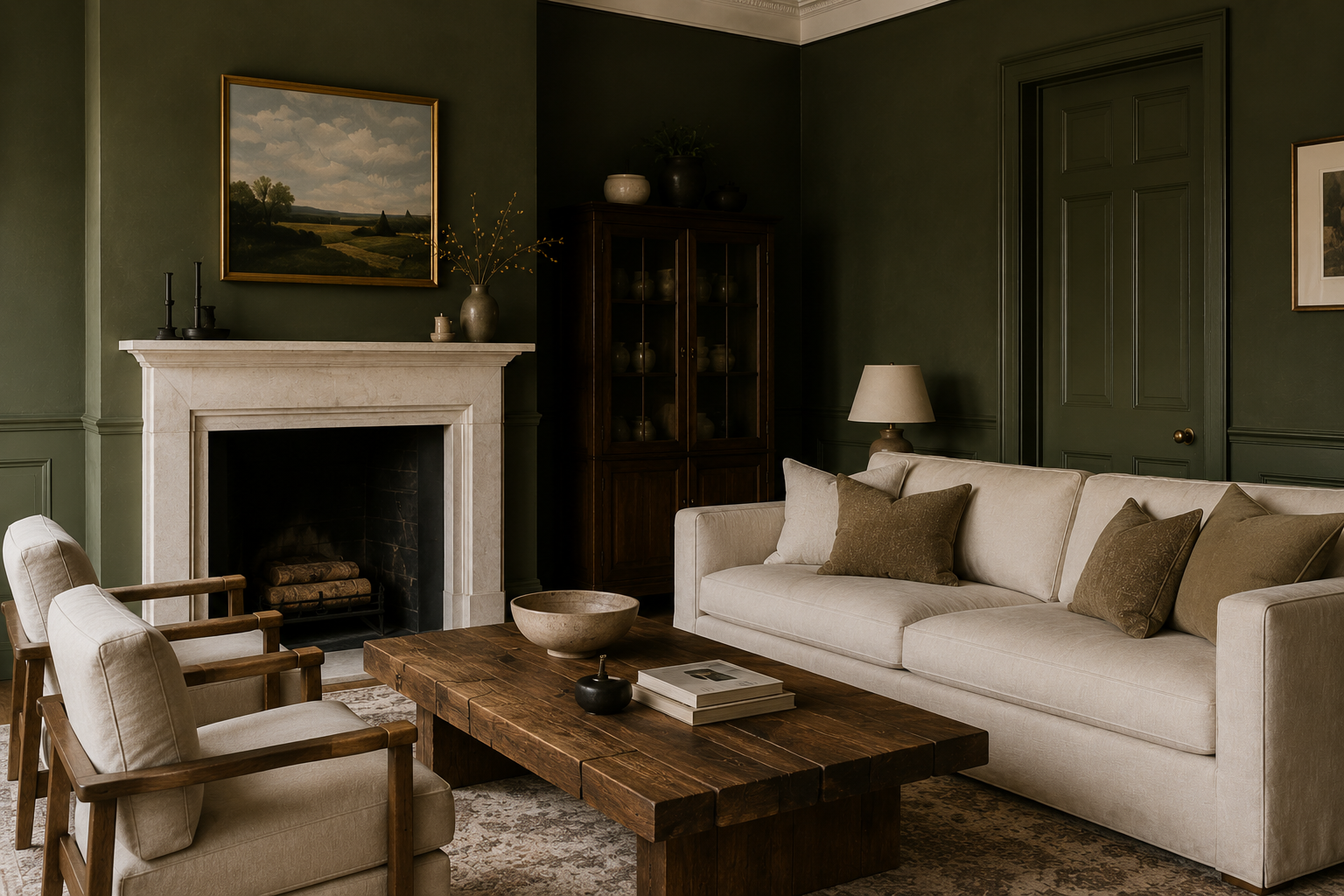
One of the Best Neutrals That Isn't Actually Neutral
Green is one of those colors I return to again and again.
Olive, moss, sage, forest, muddy green. There are so many directions you can take it, and it works incredibly well with the materials I naturally gravitate toward: warm woods, aged brass, stone, linen, leather, plaster, and creamy whites.
It also has an ability to feel interesting without demanding all of the attention.
Personally, I think we've spent enough time treating beige and gray as the only safe neutrals. A beautiful muted green can do the same job with considerably more personality.
Better Than Its Reputation
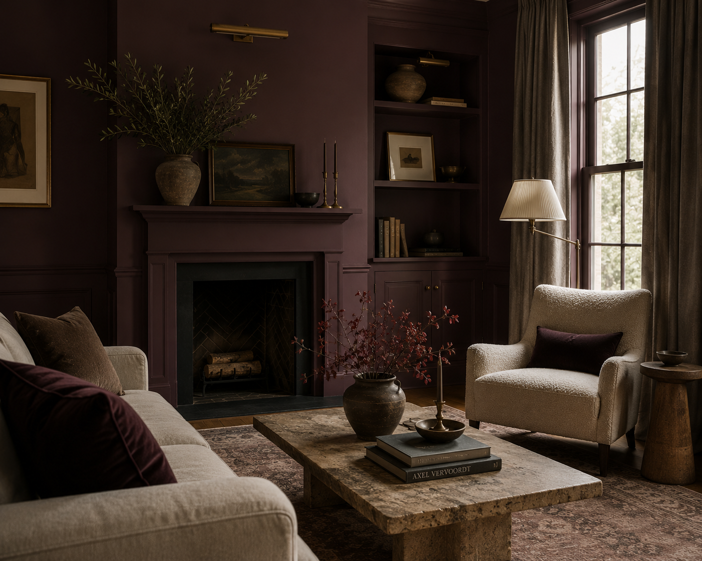
Purple makes people nervous. And I understand why. Mention a purple room and most people immediately picture something extremely purple. But plum, wine, mauve, and brown-based violets can be incredibly sophisticated. In the right room, they create depth without feeling overly colorful.
This is another color where undertone changes everything. My guest bath is a painted Behr’s beautiful “Aubergine”.
I'm probably not giving you grape-purple walls anytime soon. Aubergine with warm wood and aged brass, though? Now we're having a conversation.
Gray: We Need to Talk
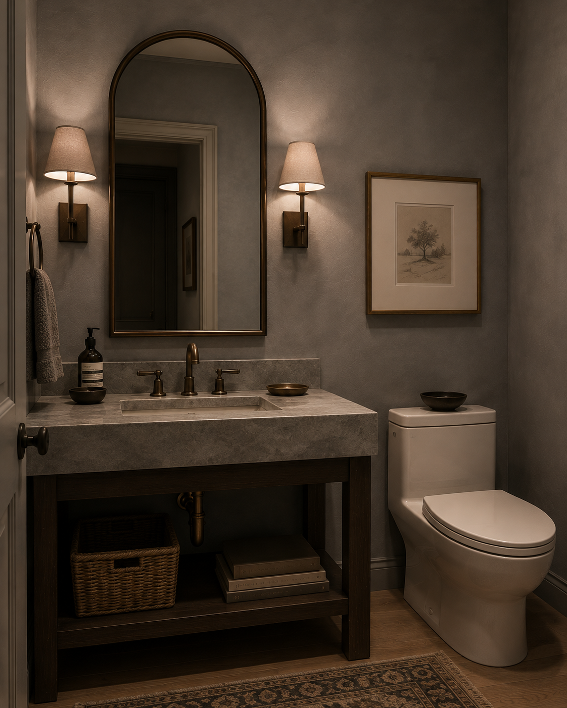
Gray isn't bad. I want to make that clear. Is it my favorite? No. But after years of gray floors, gray walls, gray furniture, gray cabinets, and somehow even gray wood, I think we've established that there can, in fact, be too much of a good thing.
A warm charcoal can be beautiful. Soft putty-gray can create a great backdrop. Gray mixed thoughtfully with warmer materials absolutely has a place in design.
The problem isn't gray. It's using gray as the default because we're afraid to make an actual decision.
A neutral room still needs depth, contrast, texture, and personality.
Much More Sophisticated Than You Think
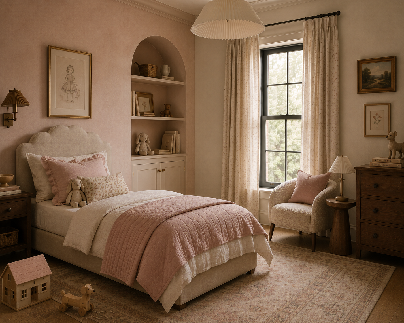
Pink doesn't automatically mean feminine, youthful, or overly sweet. Dusty rose, clay pink, plaster pink, salmon, and muted blush tones can function almost like warm neutrals. They pair beautifully with brown, burgundy, olive, cream, black, and natural wood. Used thoughtfully, pink can make a room feel incredibly warm and collected.
The trick is finding a pink with enough complexity that it doesn't immediately announce itself as PINK.
Sometimes the best colors are the ones you have trouble describing.
Drama Done Right
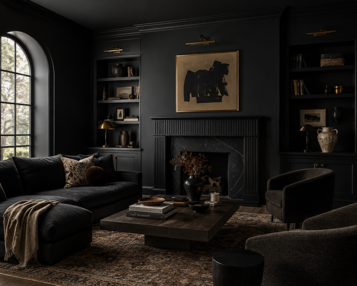
I love a dark room when the room actually wants to be dark. Black and near-black colors can make architecture feel stronger, artwork more important, and furniture more sculptural. They can also create an intimacy that simply isn't possible with white walls. But painting a room dark doesn't mean you can forget about lighting.
Actually, lighting becomes even more important.
Layered lamps, sconces, picture lights, and warm ambient lighting can make a dark room feel enveloping and sophisticated rather than gloomy.
And sometimes a room with very little natural light isn't asking you to make it brighter. Sometimes it's asking you to embrace what it already is.
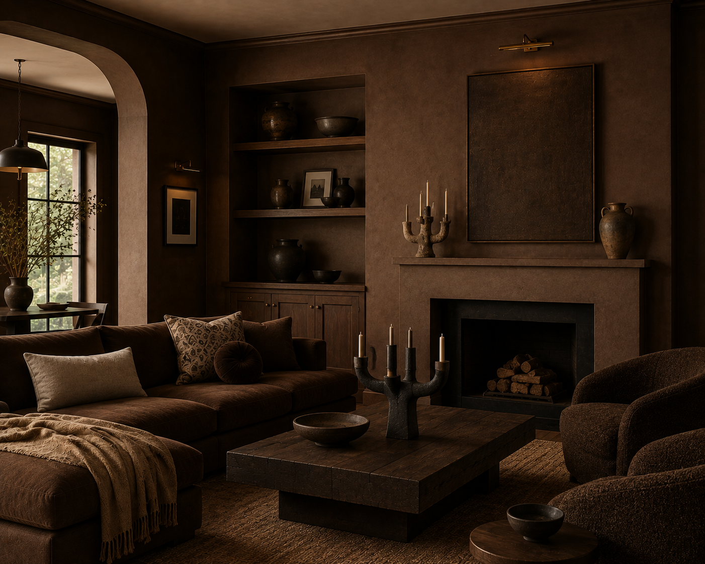
The Color I Haven't Mentioned: Brown
Brown deserves its comeback. For years, interiors moved toward cooler and cooler neutrals, and somewhere along the way brown became associated with outdated design. I'm glad that's changing.
Chocolate, tobacco, camel, espresso, walnut, and muddy earth tones bring warmth and grounding to a space in a way that cooler neutrals often can't.
Brown also plays incredibly well with other colors. Olive, burgundy, cream, dusty blue, aubergine, ochre, and black all become richer beside it. If beige feels too safe and black feels too severe, brown might be exactly what the room needs.
Forget What the Color Is Supposed to Make You Feel
Color psychology is interesting, but I don't believe you should paint your bedroom blue simply because an article told you blue is calming.
Maybe blue doesn't calm you.
Maybe the deep green dining room you grew up with reminds you of family dinners. Maybe yellow reminds you of your grandmother's kitchen. Maybe you've always wanted a burgundy library for absolutely no reason other than you think it looks incredible.
That matters more.
Good design isn't about creating the emotional response a color chart says you're supposed to have. It's about understanding how color, light, architecture, materials, and memory work together to create a space that feels right to the person living there.
So sample the color. Look at it in the morning. Look at it at night. Put it next to your flooring and your furniture. Live with it for a few days.
And then choose the one you keep coming back to.
That's usually the color telling you something.